Version 0.8 in pictures
Version 0.77 of 18 October beside Version 0.8 of 22 and 23 October 2026: the same pages, the same passage. Each change is shown the way it is best seen: as a crossfade, side by side, under the magnifier, or as live typesetting to measure for yourself.
Screenshots at 1,440 × 900 pixels in the dark theme, phone images at 390 pixels wide. Your browser sets the type samples itself, in the reader’s typeface and size.
- Characters per line in the reading text, as in a book
8775- Printed lines over the right margin, four volumes measured
270- Search: citation down to the printed line
PageLine- Lists of volumes on the home page
21- framed buttons in the toolbar
60
Home page
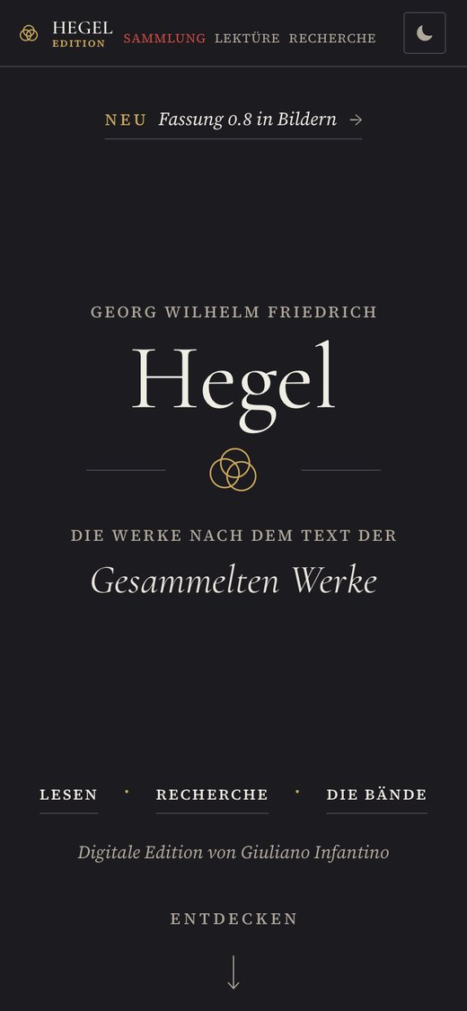
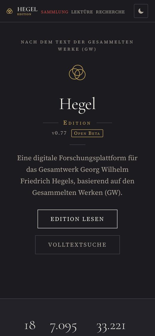
The home page begins like the title page of a volume. Only the title stands in the middle: the first names, the surname, the three rings, and what the text follows. What a title page otherwise carries in its margins stands in the margins: top left the latest news, bottom left who prepared the edition, bottom right the three ways in. “Discover” leads to the key figures and to a single list of the volumes.
The first screen · crossfade
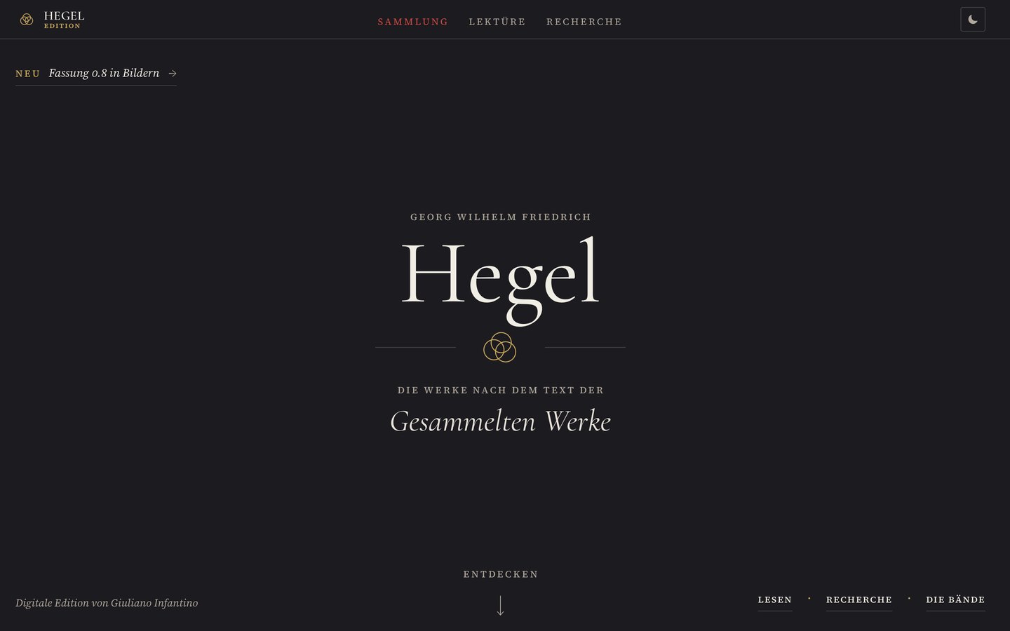

- Title page with the title alone in the middle and everything else in the margins; the margins align with the wordmark and the color button in the header, all spacing on a grid of 8 pixels.
- One list of the volumes, arranged by Early Writings, Jena, Nuremberg and Heidelberg, and Berlin; in each row the volume for reading and its TEI file.
- Key figures now count only pages with Hegel’s text, 6,630 instead of 7,095; the version stands beside them as a fifth figure.
Search
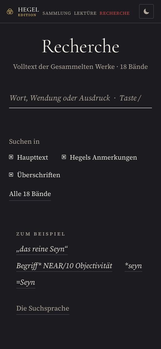
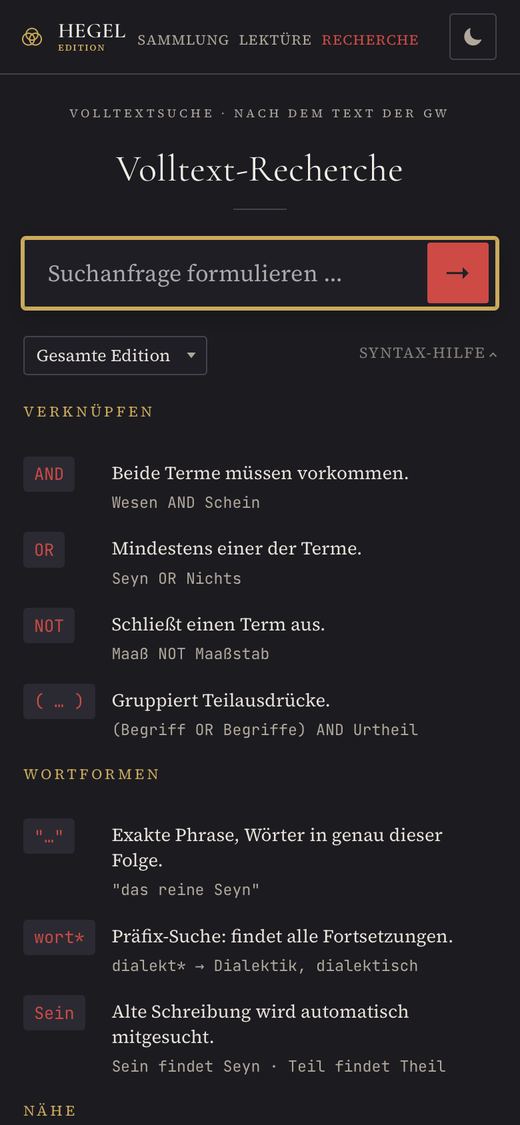
Search has been rebuilt. It cites every passage down to the printed line, shows the hits also as a concordance and as a distribution across the volumes, and finds the historical spelling for every modern one. Before the first search it shows only what you need to get started.
Before searching · side by side
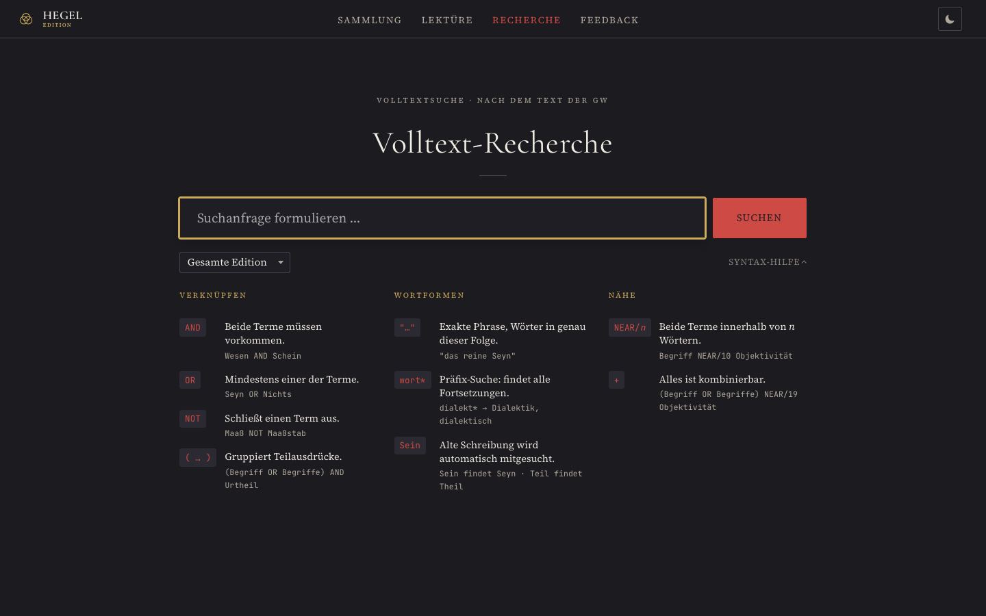
Field with a red button, below it the entire search language in three columns.
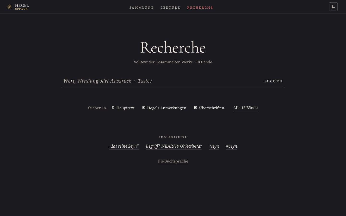
One field on a line, three checkboxes, four examples; volumes and search language expand only when you need them.
After searching: “das reine Seyn” · slider
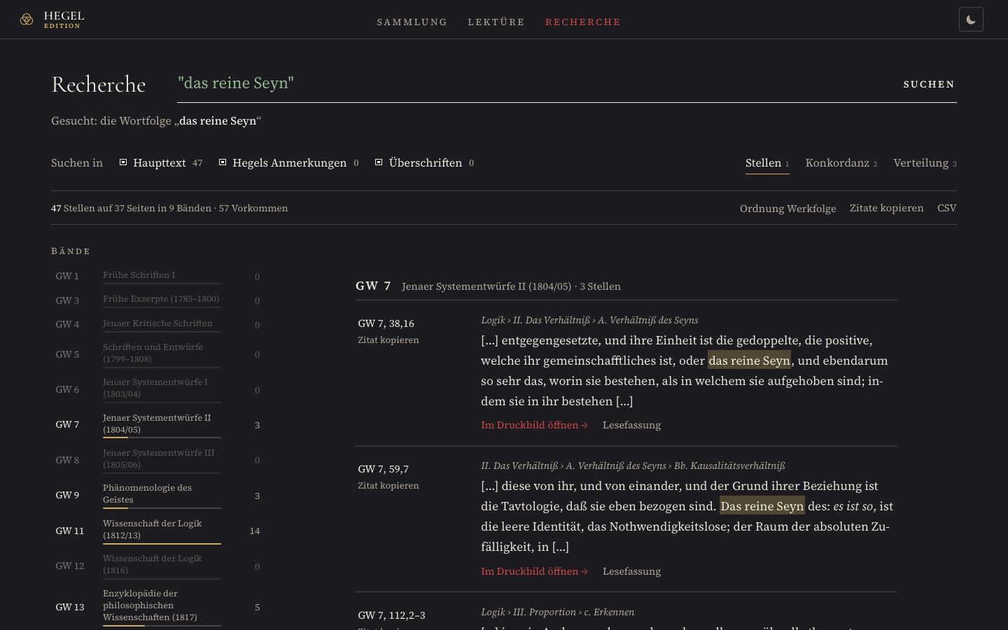
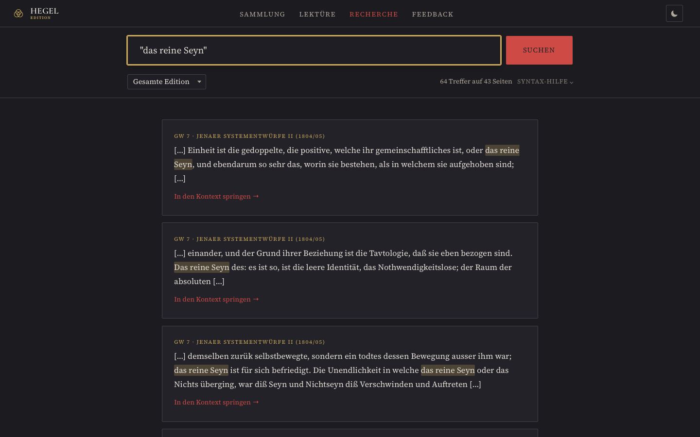
- Citation down to the line (“GW 7, 38.16”), with the section in which the passage stands; a click opens the print layout at exactly these lines.
- Three views: Passages, Concordance (one line per occurrence, sortable by the word before or after), and Distribution (frequency per volume and where in the volume).
- Counted more precisely: a passage across a page break no longer appears twice, and the page lists passages and occurrences separately.
- Hegel’s own notes are searchable for the first time. All passages can be copied as a list of citations or saved as a table.
Reader
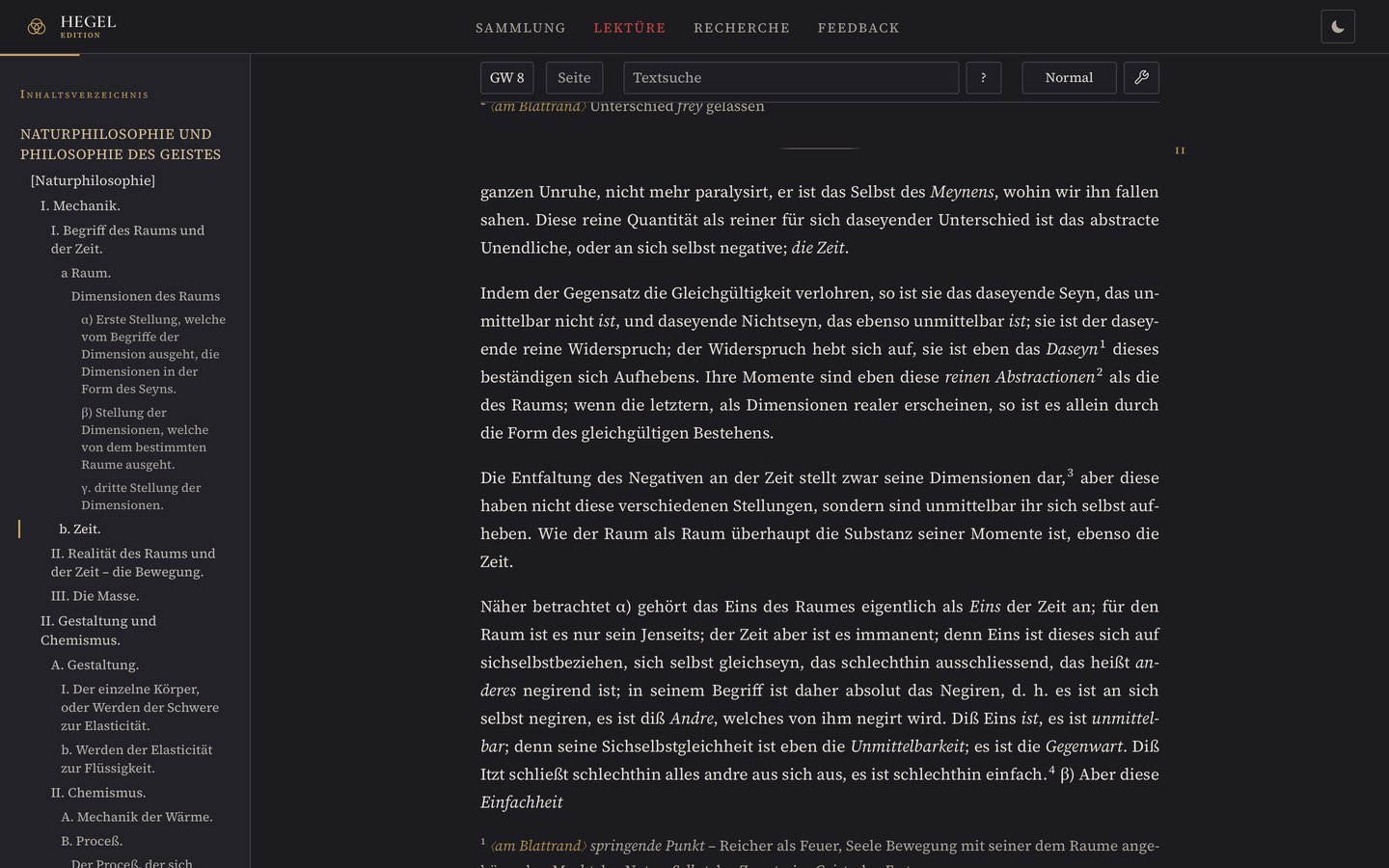
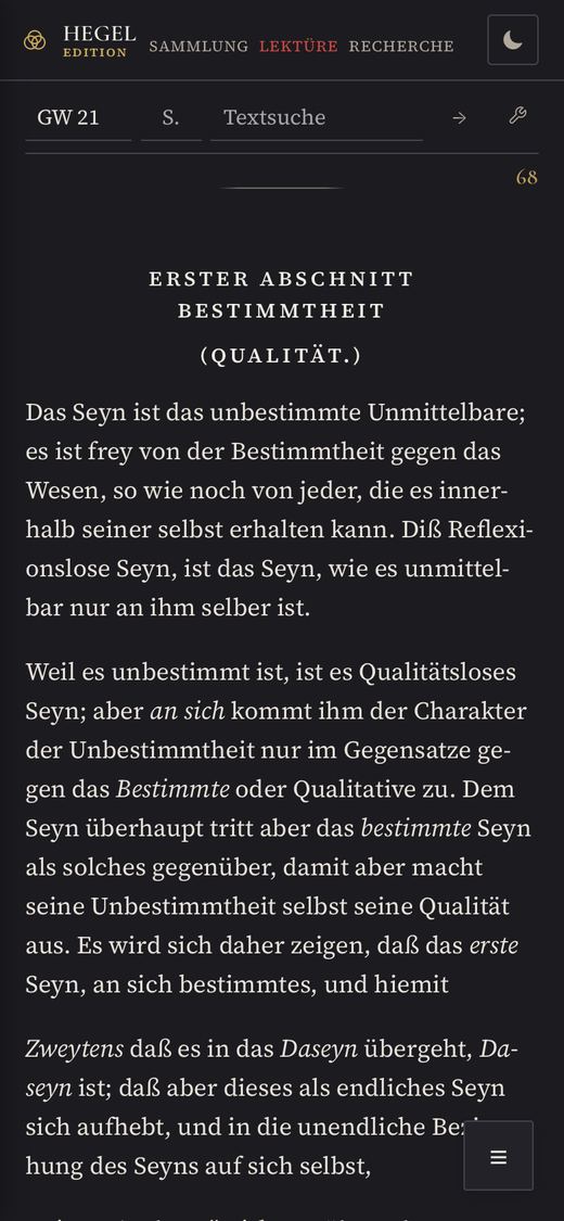
The reader has the measure of a book, justified text that no longer runs over the margin in the print layout, a hierarchy of headings that holds in both views, and a calmer toolbar. Hegel’s marginal notes stand in the margin, his tables of contents as a contents list.
The line length · to measure for yourself
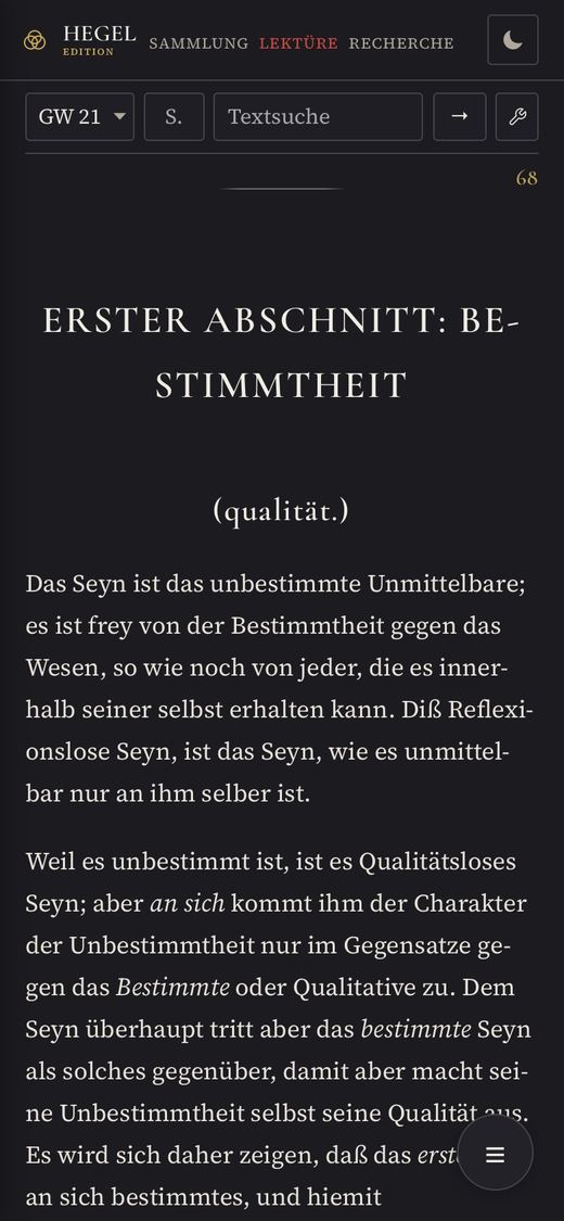
The same paragraph from GW 21, p. 68, in the same typeface and size as in the reader, once at the column width of 0.77, once at that of 0.8. To the right of each line, your browser counts the characters.
Das Seyn ist das unbestimmte Unmittelbare; es ist frey von der Bestimmtheit gegen das Wesen, so wie noch von jeder, die es innerhalb seiner selbst erhalten kann. Diß Reflexionslose Seyn, ist das Seyn, wie es unmittelbar nur an ihm selber ist.
Weil es unbestimmt ist, ist es Qualitätsloses Seyn; aber an sich kommt ihm der Charakter der Unbestimmtheit nur im Gegensatze gegen das Bestimmte oder Qualitative zu. Dem Seyn überhaupt tritt aber das bestimmte Seyn als solches gegenüber, damit aber macht seine Unbestimmtheit selbst seine Qualität aus.
Headings · from the print to the screen
Two printed lines, the parenthesis below them.

Merged into one line, with a colon; “(qualität.)” in lowercase.

The lines as printed, in small capitals of the text face; “(Qualität.)” with a capital initial.
Justified text in the print layout · under the magnifier
The print layout keeps every line of the Gesammelte Werke, so it must not rewrap. In 0.77 the column was as wide as 95 of 100 lines; the other five ran over the right margin. GW 12, p. 190, lines 9 to 15, right margin, magnified twofold:
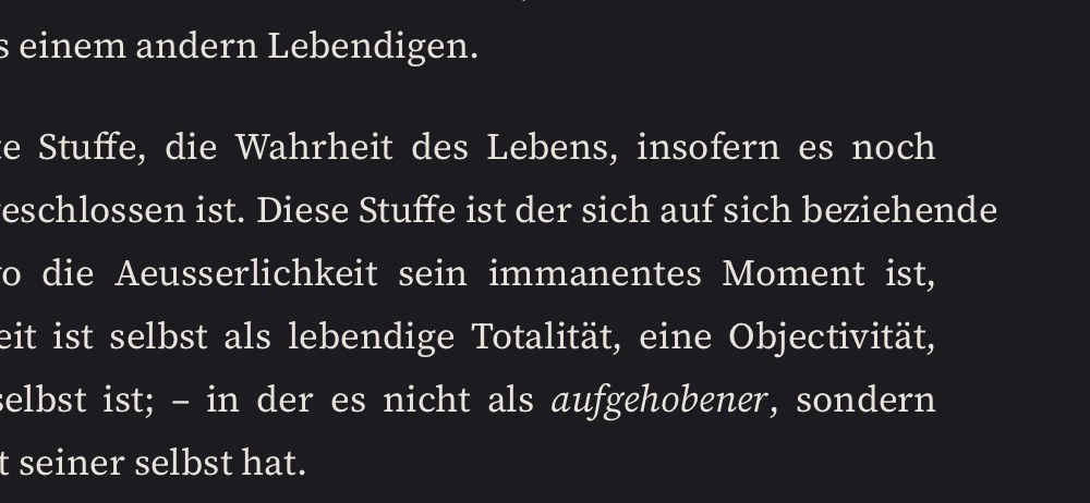 +28 px
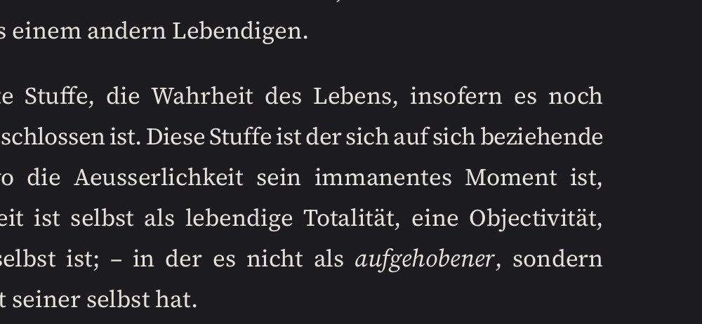
Protruding lines, at window widths of 1,000 and 1,470 pixels
| Volume | 0.77 | 0.8 |
|---|---|---|
| GW 5 | 0 | 0 |
| GW 8 | 10 | 0 |
| GW 12 | 6 | 0 |
| GW 17 | 11 | 0 |
How 0.8 fits a line · try it out
- Trackingdown to −0,012 em
- Word spacingdown to −0.07 em
- Trackingdown to −0.03 em
- Widthat most 3%
Toolbar · overlaid
 6 frames
 0 frames
Marginal notes · GW 8, page 11 · crossfade
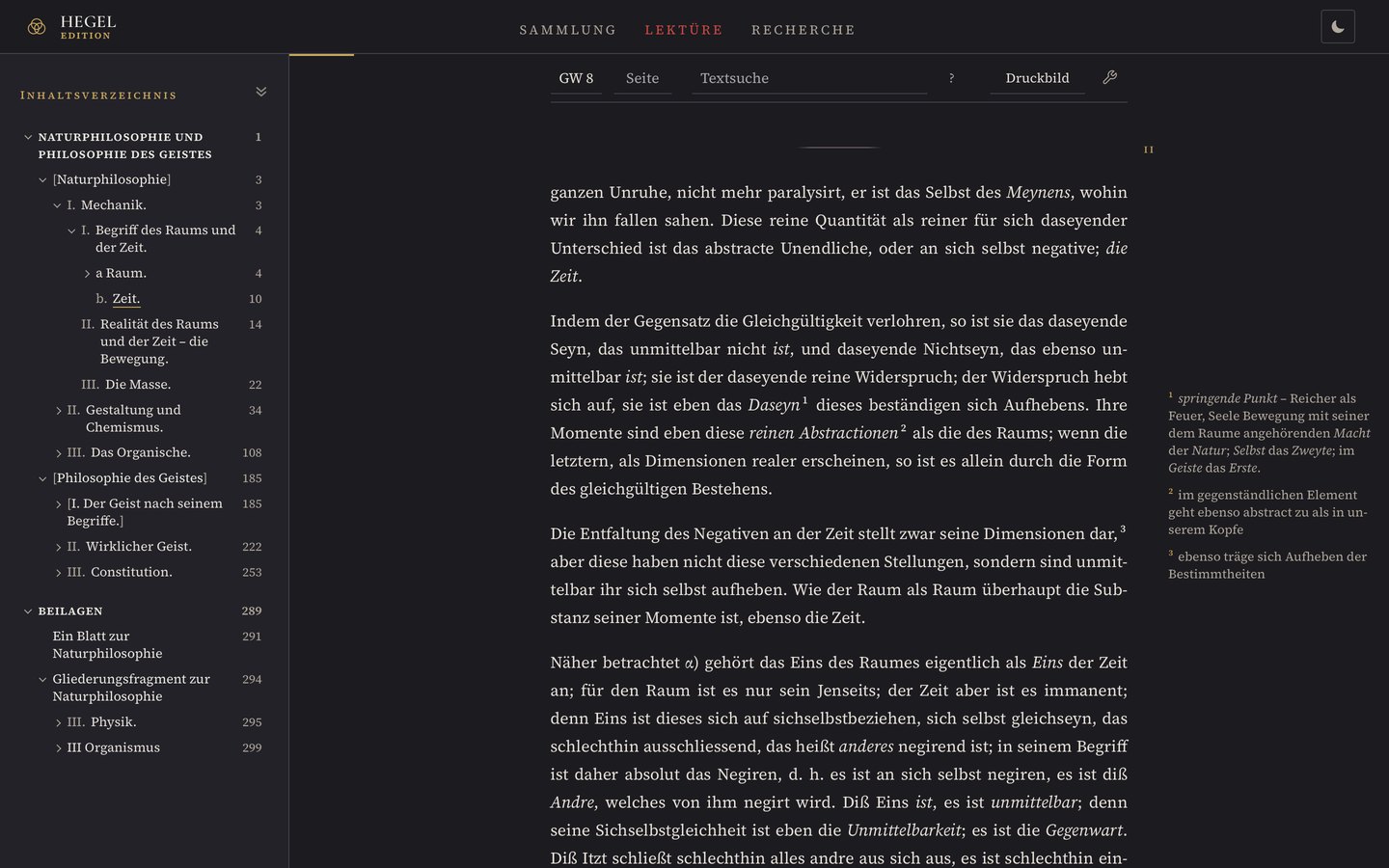
Hegel’s table of contents · GW 21, page 22 · side by side
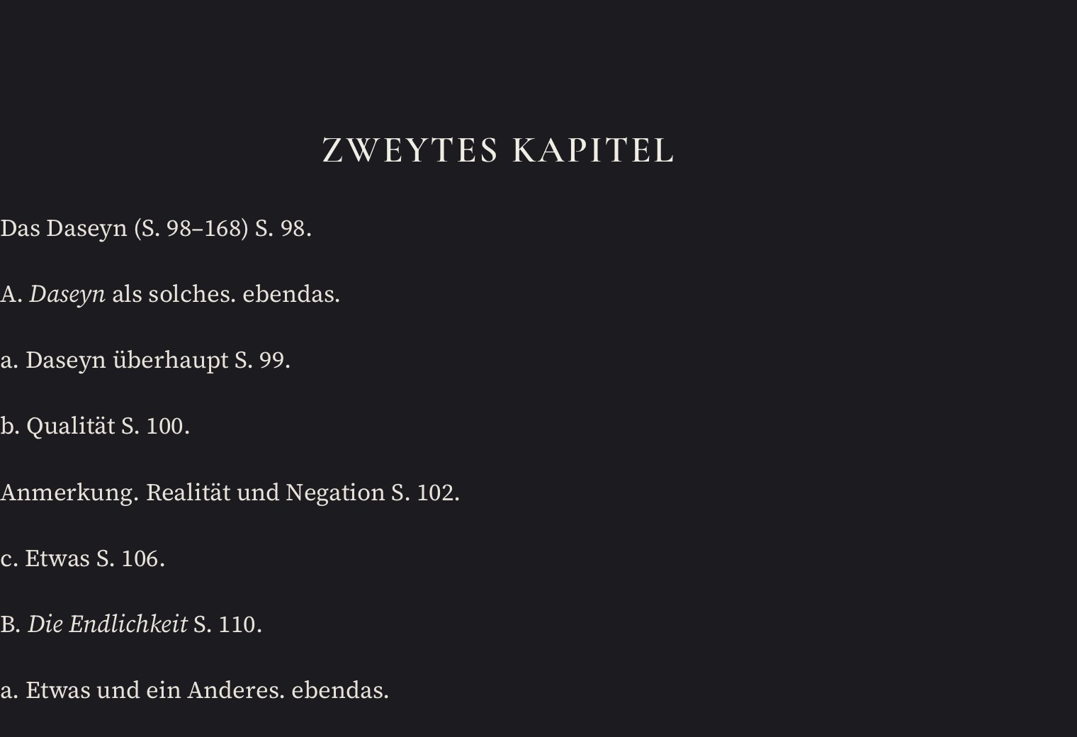
Each entry a paragraph, the page number within the text, no structure visible.
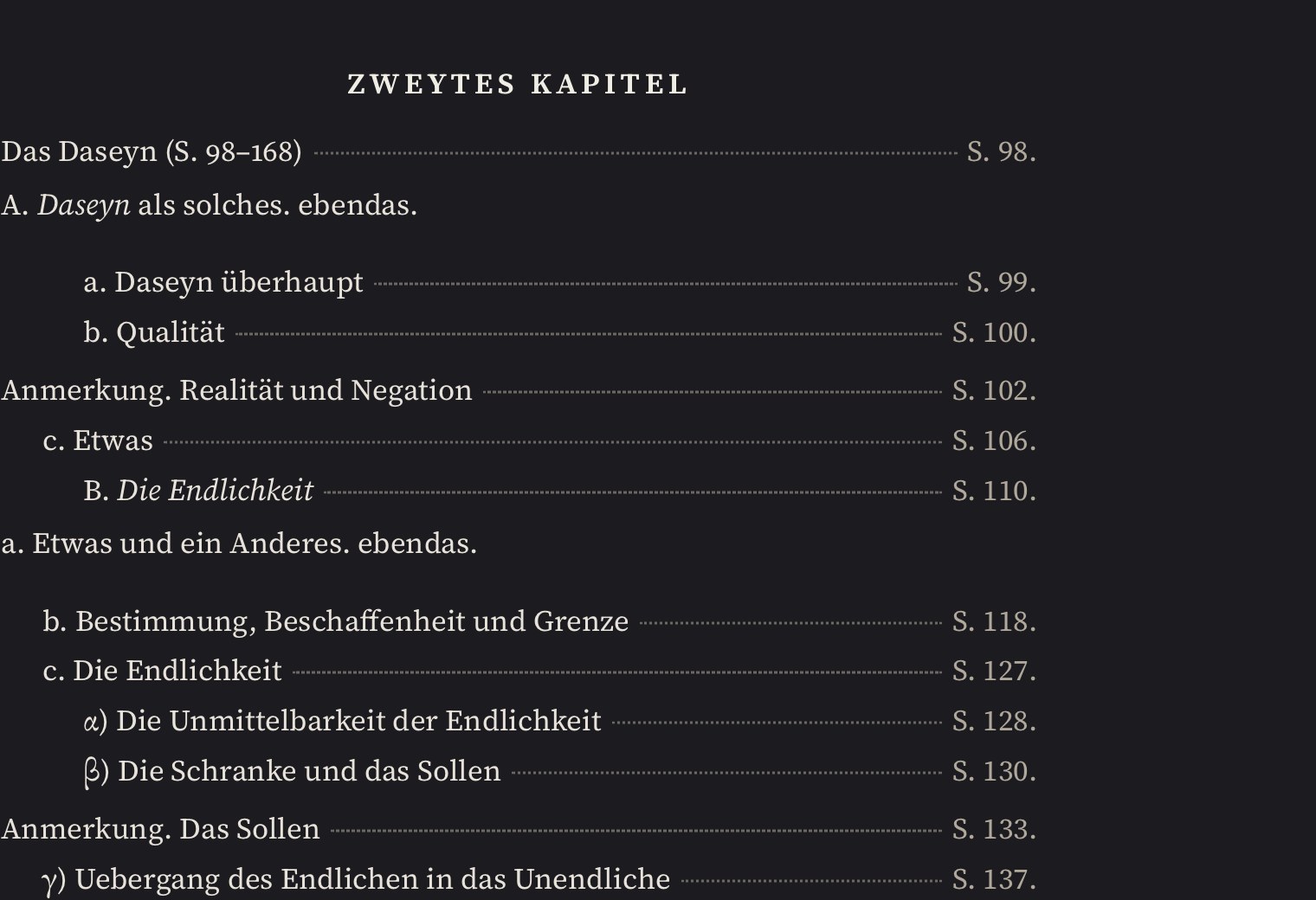
Indentation by structure, dot leaders, page numbers in a column, like a printed table of contents.
On the phone
One switch for all three phones.
The complete list of changes is in the News. Nothing in the text itself has changed with 0.8: the same data, the same 18 volumes, only set differently and easier to search.