Versions
News
What has changed in the edition, version by version, newest first. The edition is an open beta: text, presentation, and tools are being improved continuously.
0.95 A calmer page, notes in a column of their own 15 November 2026
- A calmer page. The reading text is now left-aligned, with even word spacing and fewer hyphens; the column is narrower, about 75 characters per line. If you prefer justified text, choose it in the settings (“Aa”) under “Alignment”.
- Notes in a column of their own. Members’ notes stand to the right of the text, as the counterpart of the contents: every passage of the volume in reading order, one click leads to the passage, a click on the note opens it. The column replaces the notes in the margin.
- Two symbols at the columns. Contents and notes can each be shown or hidden with a symbol at the edge of their column.
- Who could follow. The page Support shows, beneath the portraits of further authors, how much of the edition scholars cite is already freely scanned.
0.92 Notes for members 14 November 2026
- Highlight and annotate. Members highlight passages in the text and add notes to them: select text, then “Highlight” or “Note” (keys M and N). Every passage carries its reference by volume, page and line and shows in both the reading text and the print layout.
- Notes in the margin. On wide screens the notes stand to the right of their passage; otherwise a small pen in the margin shows where a note lies.
- Projects and export. Passages can be collected in projects with sections, for instance for the sessions of a seminar. The overview “Notes” in the header of every page shows everything from the three editions and exports it to Word, LaTeX, Markdown, as text or as a table.
- Account without a password. You sign in with a link sent to the email address of your membership. The texts stay free for everyone; the tool comes with membership.
- The next goal. At 40 members the series “Critics and Forerunners” begins: Jacobi, Reinhold, Maimon and Schulze.
- Removed. The button “Parallel passages” at the text selection; the search still shows similar passages.
0.84 Header, menu and two views 9 November 2026
- Two views, two measures. The reading text uses the width of the window up to 44 em (about 90 characters per line) and grows with it; the print view stays with the print, with its lines and margin numbers. The “line length” setting is gone.
- One button for the display. At the right of the header every page has “Aa”: the colour scheme (System, Light, Dark), and in the reader also type size, emphasis and the copying options. The half-circle for light and dark is gone.
- Phone. A menu with every item and the three editions; in the reading bar a magnifier opens the search field across the full width; header and bar step aside while you read and return when you scroll back; no target is smaller than 44 pixels.
- Settings carry across the editions. Moving from one edition to another takes colour scheme, type size, view and language along.
- A shorter start page. Method and accuracy are in the guidelines, copyright and the calendar of terms on the copyright page; accuracy is one of the key figures, outlook and open data one line below the volumes.
- Portraits. The three portraits of the editions are set as a series: same crop, same eye line, same tone.
- Nothing over the text. The reader survey no longer appears in the reader.
0.83 Colour, type and phone 9 November 2026
- Colours with roles. Gold shows where you are: the active menu item carries a gold line, and “TEI” in the list of volumes rests quietly on a hairline. Red is kept for what leads away: links and “Open in print view”.
- No type below 13 pixels. Volume details, page numbers, labels and tables of contents are nowhere set smaller any more.
- Search on the phone. The search scopes sit on one line; after the first search the title shrinks, and the first passage is visible without scrolling.
- Reading text on the phone. Below 480 pixels of width the reading text is set ragged right with hyphenation instead of justified; the print view stays as printed.
0.82 Typesetting in the reader 9 November 2026
- A wider reading measure. Type and column of the reading text grow with the screen: on a large monitor the text is set larger and wider, without running to the edge. In the reader’s settings the measure can be made narrower or wider. The print view stays as printed.
- Hyphenation and word spacing. The English pages now also hyphenate the text by German rules. Lines with conspicuously wide word spaces are about three quarters less frequent as a result.
- Verse, schemata and tables. In the reading text they keep their printed lines instead of running into justified prose; date and signature at the end of a letter stand as in print.
- Paragraphs across page breaks. When a paragraph continues on the next page, the reading text carries it on without a break.
- Printed tables of contents. They are set with dot leaders, and their page numbers lead to the passage.
- You stay in place. Switching between reading text and print view, or changing the type size or measure, keeps you at the same passage.
- Sidebar and headings. The titles in the sidebar line up, and the headings of the Science of Logic have their order of rank again. Hegel’s marginal notes in GW 1, 3 and 5 stand in the margin; the title pages of GW 11 and GW 21 have been added.
0.81 TEI in the DTA base format 8 November 2026
- One download format. The TEI files on the home page and in the reader under “Data” are now in the DTA base format (DTABf), the TEI format of the Deutsches Textarchiv. Every file is checked against the DTABf schema and rules, and its text matches the reader page for page.
- Paragraphs across page breaks. Until now the TEI file closed the paragraph at every page break and began a new one. Now a paragraph that continues on the next page stays one paragraph, with the page break inside it. Whether it continues was decided at each of the roughly 6,000 page breaks from the text or, where the text leaves it open, from the indent of the first line in the page image. Thanks for the pointer on X.
- More precise information in each file’s header. Editors and year of the GW volume, and the legal basis: Hegel’s text is in the public domain, and the protection of the edition under § 70 UrhG has expired.
0.8 New search, new home page, new typeface 22 and 23 October 2026
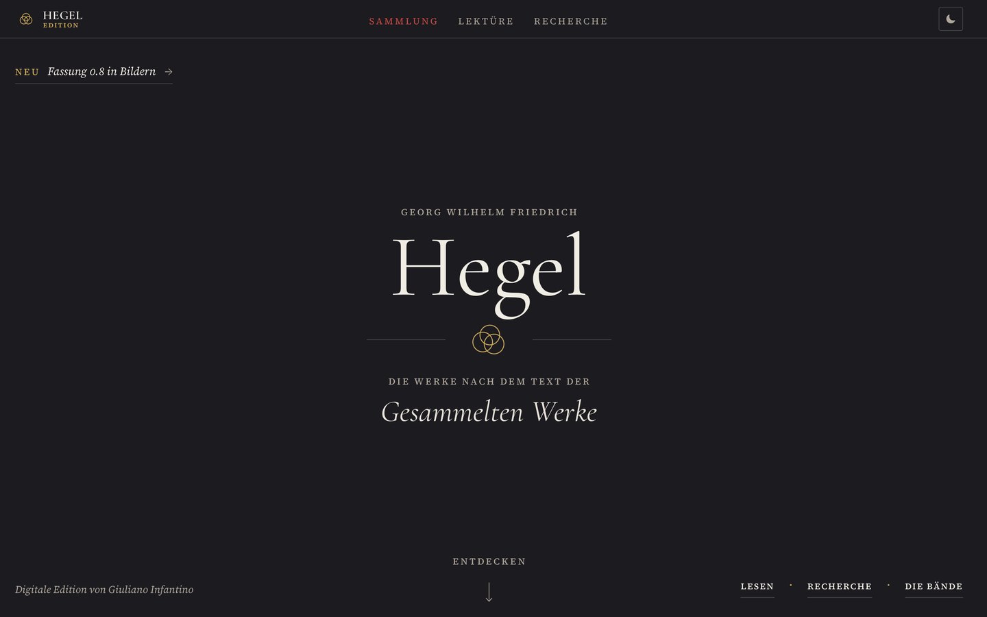 Version 0.8 in pictures →Home page, search, and reader next to version 0.77, with sliders for overlaying them.
Search
- Cited down to the line. Every passage is given with page and line of the Gesammelte Werke (“GW 12, 18.36–37”), together with the section in which it occurs, and opens in the print layout at exactly these lines. “Copy citation” copies the reference; all passages of a search can be copied as a citation list or saved as a CSV table.
- Three views. Passages, grouped by volume. Concordance: one line per occurrence, the search term in the middle, sortable by order of the works, by the preceding word, or by the following word. Distribution: how often a query hits per 10,000 words in each volume and where in the volume, from the first to the last page. A click leads to the passages of that volume or page range.
- The search language. A word now means the whole word, and modern spelling finds the historical one (Sein finds Seyn, Teil finds Theil). New are word beginnings and word endings (
dialekt*,*seyn), wildcards in the middle (ver*ung),=Seynfor exactly this spelling, the exact word sequence in quotation marks even across page breaks, proximity withNEAR/nandBEFORE/nandSENTENCEfor the same sentence, all also in German (UND,ODER,NICHT,NAH/n,VOR/n,SATZ). As you type, the field colors the query, states below how it reads it, and suggests words from the edition. - Forms. For each search term, the search shows which spellings it has found, with their frequency; each can be excluded individually.
- More text. Hegel’s own notes are searchable for the first time; main text, notes, and headings can be included and excluded individually. A passage across a page break no longer appears twice.
- First view (23 October). Without a query, the page shows only the title, field, scope, and four examples; the selection of volumes and the search language expand on demand. Title and field stay in place while searching; the views appear with the first hit.
- Faster. Instead of one large index, the page loads one file per volume. Keys:
/into the field,jandkfrom passage to passage,ccopies the citation,1to3switch the view.
Home page
- A title page (23 October). The home page begins like the title page of a volume: Georg Wilhelm Friedrich Hegel, “The works based on the text of the Gesammelte Werke,” who prepared the edition, and three ways in: Read, Search, The Volumes.
- A list of the volumes. Arranged by Early Writings, Jena, Nuremberg and Heidelberg, and Berlin; each volume with its page count, for reading and as a TEI file in the same line. The second list for the TEI files alone has been dropped.
- Key figures. Only pages with Hegel’s text are now counted, 6,630, no longer title pages and lists in addition (previously 7,095).
- Outlook as a timeline: when the remaining 31 volumes become free, from 2031 to 2045, one field per volume.
- The page is complete even without JavaScript.
Reading
- Typeface. Source Serif now in its full cut: true small capitals, old-style figures in the reading text, Hegel’s note asterisk from the typeface itself. Greek, including polytonic, comes from EB Garamond instead of a system font.
- Marginal notes. What Hegel wrote in the margin appears on wide screens next to the line to which it belongs. On narrow screens and on very dense pages it remains below the page.
- Hegel’s tables of contents are set as contents lists: dotted leaders, indentation following the structure, page numbers in a column. In GW 11, 13, 19, and 20, the numbers of the original edition lead to their place in the text.
- Title pages set centered, with the imprint in small capitals.
- Headings from the same family as the text and graded according to Hegel’s structure, from Theil and Abtheilung down to the paragraph number.
- Contents in the sidebar: ordinal marks in a column of their own, GW page on the right, deeper levels collapse and open at the current reading position.
- Typesetting: more balanced line endings, calmer hyphenation in Safari too, words in capitals within running text set as small capitals.
- Print layout. Every full line is fitted to the column individually; previously about five percent of the lines extended beyond the right margin.
- Emphasis now in three levels: italic, letter-spaced as in print, or plain.
0.77 The edition reads TEI 18 October 2026
- Reader and search now read the source TEI of each volume (TEI P5). Every volume can be downloaded as TEI-XML: on the home page and in the reader under “Data.”
- Two note anchors in GW 16 and GW 17 corrected.
0.76 GW 17 read in full for letter-spaced type 8 September 2026
- All 318 text pages of the philosophy of religion checked word by word against the page image; 96 marks corrected. The Guidelines now list GW 17 as a full count.
0.75 Letter-spaced type reassessed 6 September 2026
- All 4,159 flags from the machine check decided against the page image, plus a recall test across all 18 volumes; 235 marks corrected.
0.74 Type area and fine-tuning 2 September 2026
- Reading text limited to a calm line length, page number next to the text, headings graded, ragged-right setting on the phone. In narrow windows the print layout reduces the type size instead of rewrapping.
0.72–0.73 Smoother reading 27 August 2026
- Pages are drawn in stages while scrolling; the noticeable stutters in long volumes are gone.
0.70 18 volumes 26 August 2026
- Five new volumes, GW 18 and GW 20 captured for the first time.
0.60 Logic and Encyclopedias 20 August 2026
- Five new volumes: GW 1, 3, 11, 13, and 19.
0.50 Eight volumes, open license 13 August 2026
- Six new volumes (GW 4 to 9). Hegel’s text is in the public domain; the edition’s own contributions are licensed under CC BY 4.0.